You may notice something a bit different…
translation services
We’ve redesigned the blog in anticipation of the upcoming new year. Please let us know if anything breaks.
PS – Thanks very much to Rob Haggart from APhotoFolio for helping with the redesign and hosting this blog. He’s been a tremendous help!


A bit of CSS here and there would be nice…
Screenshot: http://i.imgur.com/shM9E.png
i see it’s already fixed.
much more up-to-date web design now, nice one.
Vinny! I’d argue “white” isn’t part of the laforet brand. Or maybe it is-what do I know? I liked the black (reminded me of the “look and feel” of LA Times Framework or NYT Lens. You’re dark, brooding, mysterious. Mr. Laforet, you’re black. And you’re blog should be this also 😀
Hmmmm.
I really think your blog column is way to wide for the font size. Also, your blog posts have double spaces after sentences. I’d refrain from doing so, just makes things feel so clunky.
From Holland Nice!
Mine’s black, so I’m partial, but this is much better…cleaner look than your older one. I double space after a sentence too, and single space after a comma…I learned it that way in high school typing class 42 years ago, you know what they say about old dogs/new tricks. 😀
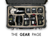
My Gear: Cameras
Seems to be missing, but the comments are there!
Nice refresh on the blog!
Not really a fan of the new look. Lacks any personality at all; pretty much a standard blog look without that Laforet uniqueness. I liked the black. I like white too, but short of the banner, this blog doesn’t look like you.
Content still rocks, and design is of course a personal choice. My 2 cents.
Like James, I think your measure (aka line length) is way too long for comfortable reading on anything but really short posts.
At ~120 characters per line it’s roughly double the rule of thumb recommendation, and whilst your leading (aka line height) isn’t super tight, it’s not exactly widely spaced for such long lines of text.
For a quick and dirty experiment you might try altering line 371 of your CSS file to:
.post-body {font-size:1.3em; overflow:hidden}
Gear page is broken. (click on cameras for example)
Looking good!
The most annoying change besides the sidebar being to wide is the fact that the sidebar is on the right side – this is wrong for so many reasons!
I vote for sidebar on the left side.
@Marcel,
what are your “so many reasons” for having the sidebar on the left? I’d be really interested in that as I have always had the sidebar in the right.
– Sebastiaj
Much better, Vincent. Cleaner is always better.
much more up-to-date web design now, nice one.
Great except my noscript Firefox plugin hates your youtube and vimeo tags even when I whitelist vimeo.com and won’t play them.
Alla Reply:
June 9th, 2011 at 12:46 pm
At last! Someone who understands! Thanks for poistng!