NYC Aerials: And The Votes are in!
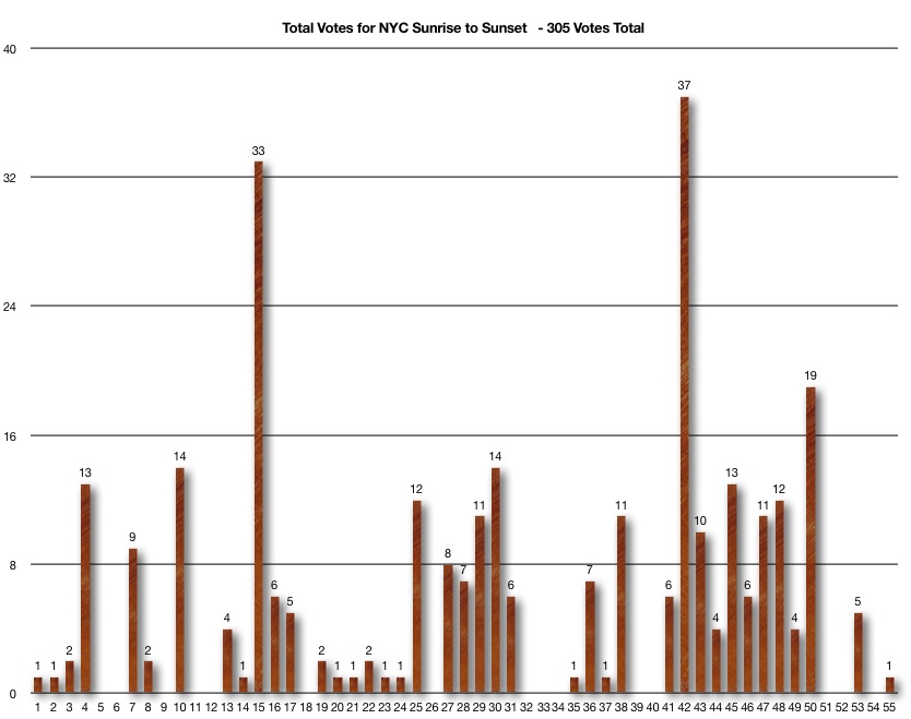
Well the results are in with a little over 300 votes and counting – and here are the 3 images that rose to the top (see galery below.)
The winning image was a clear favorite – and one of mine as well. The second place image was definitely in my top 5 as well as the image of Times Square – and many picked that one as their first choice.
I personally found this to be a very interesting experiment – it’s not something I’ve ever done before – other than with other editors – usually 1-2 photo editors at most. The largest group of people I’ve ever had to do an edit with me was at National Geographic. There were a little over a dozen editors in the projection room – all weighing in on what would make it into the magazine… Presenting one’s photographs to a room of such heavyweights is an experience I won’t soon forget…
Although I haven’t had that much time to truly analyze the results – it did re-affirm a few things for me that I’ll expound on after the slideshow below…
Top 3 of NYC Aerials – Images by Vincent Laforet
The beauty of photography and with art in general – is that everyone experiences it in their own unique way.
When I was in my teens – I never used to understand big-name artists who refused to define their art work – or refused to have others do so for them. They liked to have other people interpret their work individually. Over the years my opinion has evolved. As I got the chance to work for large papers and magazines – I got the chance to have my images be seen by a wide variety of people, and I learned that people found beauty or interest in images for so many different reasons (beyond what the photographer originally intended.)
I’ll never forget the first time I received a letter from someone who had a very strong emotional response to an image that I considered pretty unspectacular (the image was shot for a run-of-the mill newspaper assignment) – it was a hand-written letter about an establishment than had been torn down, and apparently that establishment meant a lot to that person – enough for them to write me an 8 page letter thanking me for taking the time to capture the establishment “with the respect it deserved” I had a few more similar experiences and eventually I learned to appreciate that everyone sees something different in a photograph – and finds different meanings to attach to it – relative to their eye, their life, their history.
I have always found that to be truly fascinating. If you look at the second comment on the initial post – you’ll see that Jared loves a certain image based on where he once lived…
“Tough call Vince. I am partial to NYC grew uk on 75th and Amsterdam 10,17 and 2. Love the lighting. Thanks for asking for input. Cool idea.”
One of the biggest lessons one learns as photojournalist – is that we are there to highlight everyday life.
We’re there to find the beauty in the everyday – that is far too often overlooked by others. If you think of it – the images here are just simple images of a city shot at Sunrise and Sunset – there was no historical moment or event attached to them in any way. I used to say that photographers go out there looking to make the ordinary – look extraordinary… Most people I photographed would tell me “don’t waste your time taking picture of me doing my jobs – it’s BORING!” And I would respond: “It may seem that way to you – but to many your job is quite fascinating.”
I cherish reading comments from people who think that Tilt-Shift “is cool, but with a city with so much detail, it seems a shame to blur so much of it for no apparent reason other than the fact that you can…” a statement that I could not possibly disagree with more… but that’s totally fine! The next comment that followed said “I really like the tilt shift ones giving the skyline a miniature feel to it.”
While one of my favorite sayings is indeed: “Just because you can, doesn’t mean you should,” I personally love to shoot the city with Tilt-shift lenses – because it allows me to focus the viewer’s eye on the one spot I’d like them to focus on. I find that NYC can be visually overwhelming – or just plain overwhelming in just about any category really! Sometimes less is more… Maybe in a year or two I’ll stop shooting Tilt-Shift images and do something else – who knows? I sure don’t…
Jacob commented:
“NYC_15 stayed in my mind all the way to the end, I had to come back and find it. I can see where blurring, or out of focus shots can be powerful, but there, having it all in focus, to me speaks louder. The way that one section seems to be glowing out of rest of the city is great, but also seeing that reflection allllll the way across the water.”
Usually when you hear something like that – than an image stayed in someone’s mind all the way to the end – you know you’ve got a strong image. Not surprisingly this image also received the largest number of votes. And while I did shoot the image both with and without a Tilt-shift lens – the one without the effect obviously won out – and I agree.
Max asked where the pictures would be used – and that’s an incredibly relevant question. These will be used in magazines and in commercial ads perhaps someday – but for now they are part of a larger body of fine art work that I am putting together. I can tell you for a fact that seeing these images (especially the tilt shift images) on a 30″ monitor or on a 60″x40″ gives you an ENTIRELY different view and experience as a viewer. It’s night and day relative to the small size you see them in the web gallery – I cringe when I see the images this small on the web… I’d love to be able to share them at full res… but can’t for obvious reasons.
The X Shape in #50 kept coming back as well as a big favorite. Geometric elements and crossroads are always great things to look for in any photograph.
In the end – the biggest thing that was reaffirmed for me is a lesson that I learned a long time ago when I showed my portfolio around to editors. One of the most important lessons that I’ve learned is that you (as the photographer) need to know WHO you are showing your portfolio to, WHAT they do in the world of photography, WHAT TYPE OF STYLE of photography they like (commercial vs editorial vs fine art for example) and listen to every bit of criticism from the editors looking at your work – but also: make sure you know what it is that YOU are looking to accomplish. In other words if a newspaper editor rips your work apart – you may indeed not be destined for newspapers. BUT… perhaps your work is just not suited for newspapers. You may find that a fine art photo editor absolutely loves your work!
In other words – always take into account WHO is critiquing your work and WHERE they’re COMING FROM before you start to shred your work or portfolio to pieces.
Editing one’s portfolio is also something that’s incredibly difficult for just about any photographer. At one point I would hand out tally sheets to a number of photographers in my newsrooms photo department and average out the results. It can work to help you eliminate the clear duds – but I wouldn’t recommend you put your portfolio together that way… it’s not about finding the highest average score… it’s about finding WHO YOU ARE as a photographer / artist and what you’d like to say. It’s about finding what the images as a whole – as a series – say about you as a photographer… kinda like a film…but different.
One of the best quotes I’ve ever heard during a portfolio critique was from James Nachtwey at The Eddie Adams Workshop.
He quietly looked through a students entire portfolio – and didn’t utter a single word. When he reached the last image in the student’s book – he closed it quietly, paused for a moment and said:
“I’m afraid these photographs don’t tell me anything about who you are as a photographer.”
And that was it – portfolio critique over. And definitely a quote for that person – and anyone – to disect and ponder for a long time.
Therefore – I think it’s incredibly important for me – and for you – to know what it is that we are trying to accomplish with our work.
If you go out there an shoot everything that moves, or if you find yourself shooting to make your publication or editor happy – I’m not sure you’ll find much success in this very saturated market. I think it’s important to develop a style, and most importantly a purpose and then you’ll find that your career will start to progress on its own once you start to find your voice.
With that being said -here is a gallery of my favorite 15 images from this collection – somewhat in order of preference.
You’ll see some match the public opinion – and others not at all. And that’s totally fine with me – it’s part of the thing that makes me love photography.
In the next few weeks I’ll go back to them and make a few variations in toning for a few of them – and create master files to add to my fine art print collection. No rush. The images aren’t going anywhere… they’re always frozen in time – or is it the other way around?
p.s. feel free to CLICK ON THE IMAGE – to see them a little bit larger in a separate gallery.
My Selects – Images by Vincent Laforet




Number 15 is indeed a great image, but I did not select it because I’ve seen many similar aerial images from New York dating back to the 80’s (There was a tabletop book called something like “Above New York”. The “newer” ones with the bright advertising lights are more “uncommon”.
I voted 2 of the three winner!! Did I win something?! Only joking! Thanks Vincent I’m very proud to be a part of this work!!!
Image 15 is a great one but it makes me think that the gulf is full of oil! That plunges me in shock.
Vince, I wholly agree about [artists working in all media] learning – remembering, really – to express who they are in their work. The thing is we all knew how, back when we were 4 or 5 years old.
I’d like everyone to rediscover that wonder of childhood, so I really appreciate you posting your thoughts. It’s nice to know I’m not the only one encouraging others to “find your own voice”.
Thanks again for showing me my former home from a new perspective / angle!
i wish I got to this sooner, then i could have voted! however, i did like #7 of your final 15 the most out of the original 55 – the T/S photo facing east with the white sailboat. it’s hard to make an assignment like this fresh because of the decades’ worth of photos taken of the city, so i personally liked the ones that didn’t focus on the typical city landmarks and gave a fresh view of the city i otherwise wouldn’t have seen.
“it’s about finding WHO YOU ARE as a photographer / artist and what you’d like to say. It’s about finding what the images as a whole – as a series – say about you as a photographer”
great point – i wholeheartedly agree. Crowd-sourcing/focus grouping very often gives inferior, bland, and generic results because you’re getting a generic opinion by nature! Ed Tufte, info presentation guru, hammers the same point repeatedly in his work–the common denominator tends to be the lowest. Ex: comparing Microsoft’s focus group approach vs. Mac’s focused, singular approach. Mac OS X trumps Windows’ interface any day!
I was one for three, but the other winners were variants of the ones I chose.
Thanks for the fun exercise.
I didn’t get to vote! Darn. I say – 4, 7, and 9. Why didn’t anyone pick 9? 🙂
-Sophie
sophie Reply:
July 13th, 2010 at 10:31 am
@sophie, Sorry brotha! My mistake – I didn’t see the original group of pics. I’m choosing 4,7,9 from Vincent’s 15 picks. Not sure what they correspond to.
Very nice sharing.thanks
I voted 2 of the three winner!! Did I win something?! Only joking! Thanks Vincent I’m very proud to be a part of this work!!!
Hey! I just would like to provide a huge thumbs upward for this wonderful tips you have in this article on this blog post. I’ll be coming back again to your blog for even more soon.